Search
Loading
|
Posted by
WallpaperHungama
at
Thursday, October 23, 2008 |
0
comments
Most Beautiful Architectural Optical Illusions.As architects struggle to balance aesthetic appeal with practical considerations, many are finding the best way to create bold, interesting, even mind-bending features is through the use of optical illusions. In effect, our own eyes are being used against us - and nobody�s complaining about the results!
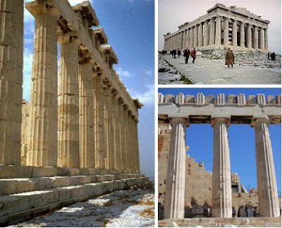
The use of optical illusions in architecture isn�t new; in fact one of the most outstanding examples is the Parthenon in Athens, Greece, constructed over 25 centuries ago.architects don�t make the structure look like something it isn�t - instead, they correct the viewer�s perceptions so that the temple looks as it should. Slightly wider corner columns, pillars that curve inwards and a floor that is 6 cm (2.4 inches) higher at its center all conspire to give the Parthenon an enduring beauty that is evident even in its current state.
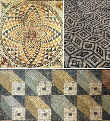
Architects of the Classic Era worked mainly in stone, and the ancient Romans applied newly discovered knowledge of optics and perspective to create the amazing optical illusion mosaic floors shown above.
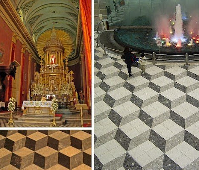
The Middle Ages and the Renaissance saw a rebirth of science, art and design as epitomized in the magnificent paintings of Leonardo da Vinci and Michaelangelo. Their influence was (and is) felt around the globe, as seen in the floor of Saltas cathedral in Argentina (above left) and the painted floor of Tokyo�s Sunshine City shopping center (above right).
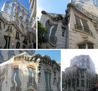
Modern architects often use traditional forms and styles as a starting point, then warp them to create something new that - either amusingly or disturbingly - puts a new twist on what we expect to see. The so-called Melting Building, created by artist Peter Delavie for France�s Athem Co., is actually made from tarpaulins draped over the sides of a Paris building under construction.
Here is another of Athem�s buildings, this one after completion. A clever mix of inorganic stone and organic greenery softens the sever outlines of the structure while adding a note of whimsy.
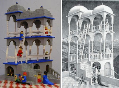
The late M.C. Escher was widely known for his curious paintings and drawings that played with perspective in unusual ways, yet still conformed to mathematical theories. Many of these depicted �impossible� buildings and architecture, with some better known examples shown above.
Even The Simpsons have gotten in on M.C. Escher�s act!
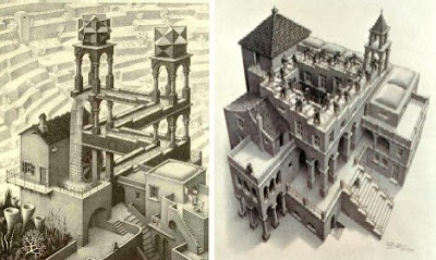
Some architects have taken M.C. Escher�s unspoken challenge and have tried to create actual structures which reflect the late artist�s virtual reality. Examples of these include, clockwise from above: Ludwig Maximilians University of Munich, a pavilion by Aldo Benedetti and this ethereal Stairway to Nowhere - no connection to Sarah Palin
Architects who seek less mind-bending architectural optical illusions simply turn the concept upside down� by turning the building upside down. Above are three examples, one from Japan (left) another from Poland which mocks the Communist era (right) and Orlando�s famous Wonderworks House (lower).
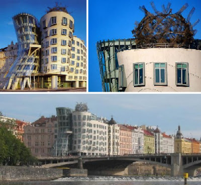
Eastern Europe boasts a surprising number of surprising buildings designed both before and after the fall of the Soviet Union and its associated regimes. One of the most famous is the Dancing House (Nationale-Nederlanden building) in Prague, Czech Republic. Built between 1992 and 1996 and designed by Vlado Milunc and Frank Gehry, the building houses one of Prague�s best restaurants on its top floor and gives visitors excellent riverside views of the city�s historic downtown.
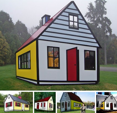
When is a house not a house, even though it looks like a house? If you think you�re confused now, try visiting the Roy Lichtenstein House. There are actually two of these intriguing structures: a fiberglass structure from 1997 located at LongHouse Reserve, East Hampton New York, and a painted aluminum version from 1998 located at the National Gallery of Art�s Sculpture Garden in Washington DC. Here�s a video illustrating what it would be like to walk around one of these odd houses:
The amazing Roy Lichtenstein House!
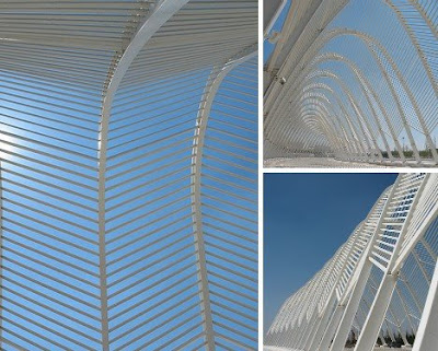
Optical illusion architecture doesn�t have to take the form of a house, building or other such structure, as this intriguing walkway and associated installations in Athens, Greece so eloquently illustrate. Built for the 2004 Summer Olympic Games and designed by acclaimed artist/architect Santiago Calatrava, these structures interact with sunlight to create a complex panoply of light and shadow that fools the eye while soothing the mind.
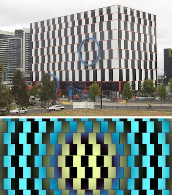
Our final and perhaps finest example of an optical illusion building is the Australian Customs Service building, located in Melbourne, AU, and completed in 2006. Each floor of the building is exactly the same height, yet the tessellation pattern of black & white rectangles separated by parallel orange lines gives quite a different impression. The building was designed to display the so-called Cafe Wall Illusion originally noted in 1979 following the completion of a caf� in Bristol, England. Hard to imagine enjoying a warm cuppa in the presence of that disturbing pattern!
When it comes down to it, optical illusion buildings allow developers to attract attention without the need for expensive construction techniques. Keeping the eye fooled can keep the bank account - and the buildings - filled.
Via
Labels:
Architecture,
Optical Illusion,
World
Add Post To: Digg | Technorati | del.icio.us | Stumbleupon | Reddit | BlinkList
Share this:
Spread the word, using :
Bookmark These:
Subscribe Using These:
Most Beautiful Architectural Optical Illusions.As architects struggle to balance aesthetic appeal with practical considerations, many are finding the best way to create bold, interesting, even mind-bending features is through the use of optical illusions. In effect, our own eyes are being used against us - and nobody�s complaining about the results!
The use of optical illusions in architecture isn�t new; in fact one of the most outstanding examples is the Parthenon in Athens, Greece, constructed over 25 centuries ago.architects don�t make the structure look like something it isn�t - instead, they correct the viewer�s perceptions so that the temple looks as it should. Slightly wider corner columns, pillars that curve inwards and a floor that is 6 cm (2.4 inches) higher at its center all conspire to give the Parthenon an enduring beauty that is evident even in its current state.
Architects of the Classic Era worked mainly in stone, and the ancient Romans applied newly discovered knowledge of optics and perspective to create the amazing optical illusion mosaic floors shown above.
The Middle Ages and the Renaissance saw a rebirth of science, art and design as epitomized in the magnificent paintings of Leonardo da Vinci and Michaelangelo. Their influence was (and is) felt around the globe, as seen in the floor of Saltas cathedral in Argentina (above left) and the painted floor of Tokyo�s Sunshine City shopping center (above right).
Modern architects often use traditional forms and styles as a starting point, then warp them to create something new that - either amusingly or disturbingly - puts a new twist on what we expect to see. The so-called Melting Building, created by artist Peter Delavie for France�s Athem Co., is actually made from tarpaulins draped over the sides of a Paris building under construction.
Here is another of Athem�s buildings, this one after completion. A clever mix of inorganic stone and organic greenery softens the sever outlines of the structure while adding a note of whimsy.
The late M.C. Escher was widely known for his curious paintings and drawings that played with perspective in unusual ways, yet still conformed to mathematical theories. Many of these depicted �impossible� buildings and architecture, with some better known examples shown above.
Even The Simpsons have gotten in on M.C. Escher�s act!
Some architects have taken M.C. Escher�s unspoken challenge and have tried to create actual structures which reflect the late artist�s virtual reality. Examples of these include, clockwise from above: Ludwig Maximilians University of Munich, a pavilion by Aldo Benedetti and this ethereal Stairway to Nowhere - no connection to Sarah Palin
Architects who seek less mind-bending architectural optical illusions simply turn the concept upside down� by turning the building upside down. Above are three examples, one from Japan (left) another from Poland which mocks the Communist era (right) and Orlando�s famous Wonderworks House (lower).
Eastern Europe boasts a surprising number of surprising buildings designed both before and after the fall of the Soviet Union and its associated regimes. One of the most famous is the Dancing House (Nationale-Nederlanden building) in Prague, Czech Republic. Built between 1992 and 1996 and designed by Vlado Milunc and Frank Gehry, the building houses one of Prague�s best restaurants on its top floor and gives visitors excellent riverside views of the city�s historic downtown.
When is a house not a house, even though it looks like a house? If you think you�re confused now, try visiting the Roy Lichtenstein House. There are actually two of these intriguing structures: a fiberglass structure from 1997 located at LongHouse Reserve, East Hampton New York, and a painted aluminum version from 1998 located at the National Gallery of Art�s Sculpture Garden in Washington DC. Here�s a video illustrating what it would be like to walk around one of these odd houses:
The amazing Roy Lichtenstein House!
Optical illusion architecture doesn�t have to take the form of a house, building or other such structure, as this intriguing walkway and associated installations in Athens, Greece so eloquently illustrate. Built for the 2004 Summer Olympic Games and designed by acclaimed artist/architect Santiago Calatrava, these structures interact with sunlight to create a complex panoply of light and shadow that fools the eye while soothing the mind.
Our final and perhaps finest example of an optical illusion building is the Australian Customs Service building, located in Melbourne, AU, and completed in 2006. Each floor of the building is exactly the same height, yet the tessellation pattern of black & white rectangles separated by parallel orange lines gives quite a different impression. The building was designed to display the so-called Cafe Wall Illusion originally noted in 1979 following the completion of a caf� in Bristol, England. Hard to imagine enjoying a warm cuppa in the presence of that disturbing pattern!
When it comes down to it, optical illusion buildings allow developers to attract attention without the need for expensive construction techniques. Keeping the eye fooled can keep the bank account - and the buildings - filled.
Via
Add Post To: Digg | Technorati | del.icio.us | Stumbleupon | Reddit | BlinkList
Share this:
Spread the word, using :
World's Most Beautiful Architectural Optical Illusions
Bookmark These:
Subscribe Using These:
0 comments
Post a Comment